 Written by T.K. Dalton
Edited by Jesi Khadivi
Diagrams by Gil Andrei Fontimayor
Andric applies his rigorous aesthetic to everything he shoots. “Everything in the shot is a choice. If there’s a lamppost on location and I do not remove it, it’s almost as if I put it there on purpose,” he says. A master of both still life and location imagery, Andric has a long list of clients including AT&T, Panasonic, Palm and Corona. He is also one of Lurzer’s International Archive’s “200 Best Ad Photographers Worldwide” from 2006-2007. His range from studio product shots to surreal location imagery is impressive. The latter, he says, is “too easy in photography, especially with [the] post-production that you can do.” Life is stranger than the fiction of the image, he suggests, adding that art should strive to produce moments that “just slightly extend what’s possible.”
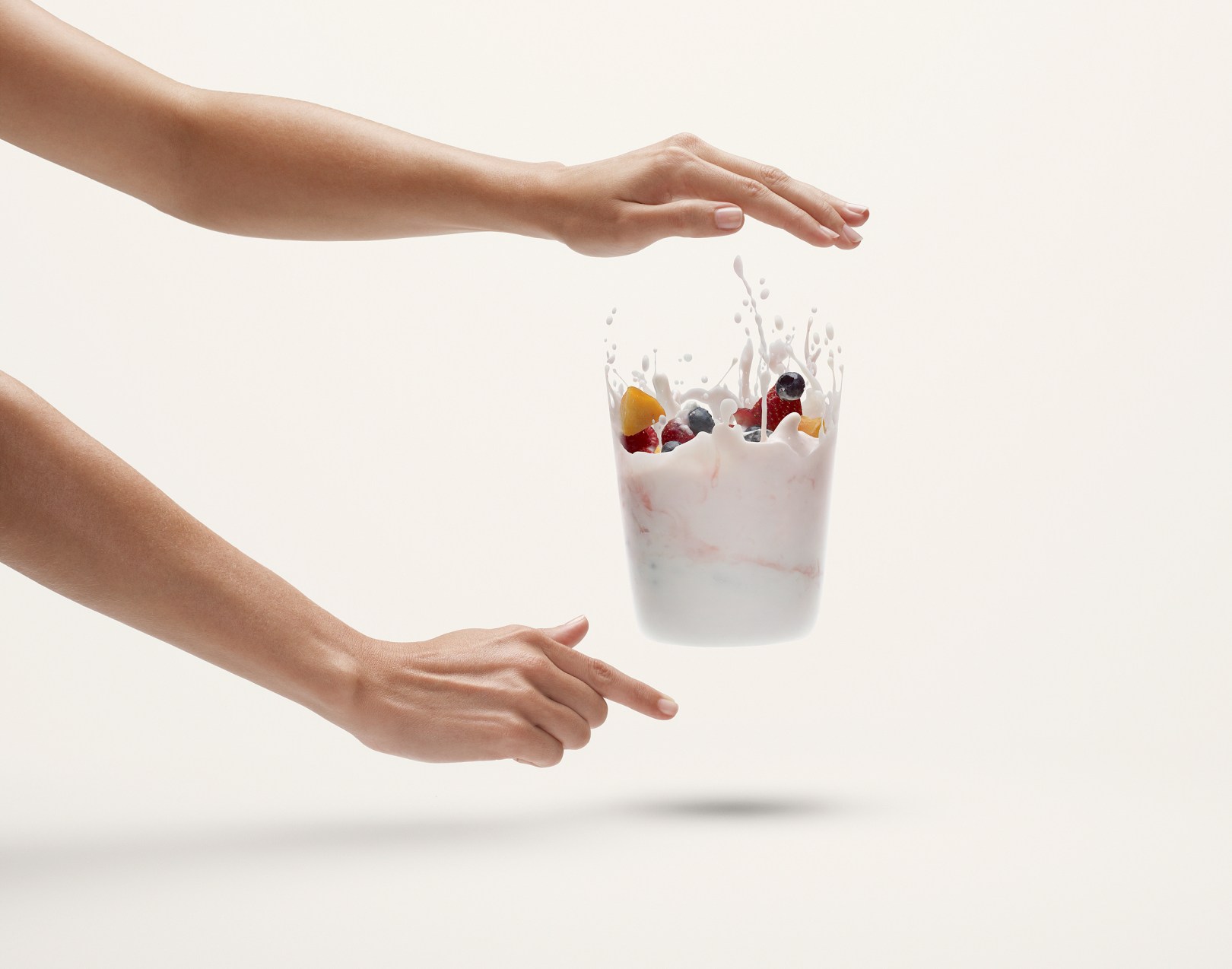
 He shot our featured image for IGA, a Canadian supermarket chain. The clear blender was the key to communicating his client’s mantra: “Disregard the packaging, look at the content,” as Andric puts it. The image was highly visible, plastered across not just magazine spreads and in-store displays but also on billboards and even the sides of delivery trucks. The crew’s session took all day. The blender was adapted, the engine dismantled, the blades adjusted and placed in a clear acrylic cylinder. Andric attached some vertical phone cord to spread the splatter. Wanting to make it look less like a standard still life shot, he selected a wide angle lens to give the image a different feel from the standard product shots done using more telephoto lenses. Andric captured all the images with a Hasselblad H2 camera with a Phase One P 45 phase back and a 80mm lens. He used an aperture of f/13 and a shutter speed of 1/125th of a second, but the exposure was really determined by the flash duration, which was
 1/8000th of a second on Bronclor Grafit A2 packs. The lighting consisted of a Broncolor Hazylight above the product and a Broncolor ring flash for fill. Andric took 70 shots of the splashes and an additional 30 of still pieces, yogurt densities, and hands. He modified the background color to be very slightly off white so the yogurt would read as 100% white. He insisted on using real food rather than the glue more commonly used in food shoots, as well as not one but two adapted blenders to maximize efficiency on the shoot. Andric tasked an assistant with cleaning the cylinders while he shot about a hundred images. “We chose maybe six or seven different splashes for the top of the image and we just combined them in a way that made sense.” he says. “Once all that was assembled we just removed the cylinder in post-production.”
Andric has a unique talent for bending the limits of reality in a subtle yet convincing way. In one image a woman effortlessly kayaks through rolling hills covered in tall grass; it appears believable until one realizes…kayaks don’t move so easily on land. In another image, a young woman pulls a giant white bag of balloons, simultaneously seeming both weightless and massive, through a bizarre underground structure. As his experience has accumulated throughout the years he has battled routine with randomness. “What catches your attention is visual ambiguity,” he says, adding that in commercial work, neither ambiguity nor reality can be forced.
Andric was interviewed by our Editor Zack Seckler about his career and his craft:
F STOP: A lot of the work that you do is more location based. How did the client come to think of you for this shoot?
Andric: I moved to North America from Italy about five years ago. This is my twentieth year in the business. I did a lot more still life and studio photography in Italy than I did here. European advertising is much more constructed reality indoors. I think people do not relate to the outdoors as intensely as we do here. There’s more big open spaces in North America, so it carries a stronger emotional content and value in advertising. I’ve done several jobs of different natures with the agency before. Some of them are on my website. I won three or four awards with them. I’ve known the creative directors and everyone there for many years. In this particular case, they thought I was a good choice because they knew I do most of my own post-production and I’m detail oriented.
F STOP: Tell me about how you created our featured image.
Andric: The campaign was for a large supermarket chain in Canada that is known for the quality of their produce. Not only did we have the implementation of a normal print campaign, the image was on trucks and large in-store posters. This all required highly detailed, high resolution images, especially because its food and we wanted to make sure that everything looked crunchy and yummy. We chose digital so we could have immediate feedback. It was also the logical choice for shooting movement. The image was shot with a P-45 back and the flash equipment was Broncolor. I was able to bring the speed for the duration of the shot up to 1/8000th of a second and still maintain the color balance. I could have a blender spinning full speed and still freeze the droplets in mid-air. There was a degree of randomness with the blender that was impossible to control. In this case we decided to create machines that produced the splashes the way we wanted it rather than do any 3-D stuff. Our prop guy took a hand blender, dismantled the engine and the blades that spin and put them upward in a clear new acrylic cylinder which was very thin. Instead of having the blades spin horizontally as they do in your home blender we applied two pieces of vertical phone cord. I did maybe a hundred shots. We chose the basic pieces from them and then we chose six or seven different splashes for the top of the image and combined them in a way that made sense. Once all that was assembled we removed the cylinder in post-production. We shot with a relatively wide-angle lens because we wanted to make it feel less like a pack shot. We also wanted to emphasize the movement because the wide-angle effect, however slight it was in our shot, always added something to the movement. The background was plain white. We added a hint of warm color on the top to make the white stand out. If the direct background was completely white my yogurt would look grey. We introduced around a 6% density on the background because that is the least that you will successfully read in a print newspaper. They have a number of applications so we had to be on the safe side. The highlights of my yogurt were a pure white so you could see that that substance is whiter than the background. It’s funny how the eye does it’s own white balance. If you do such a background as we did, your eye reads that as complete white so your yogurt looks suddenly even brighter than white. That’s a basic outline. All of the shots in the campaign had pretty much the same procedure, but they all presented different technical issues. For example: how do you make the movement real? How do you avoid the glass container? We had to use glass containers in every case, so we found that the thinnest glass we could get. Anything that’s even marginally thicker, will introduce it’s own distortion. We had to make a lot of little adjustments throughout to compensate for distortion. We had to do some liquefying in Photoshop to bring back the straight lines.
F STOP: You mentioned that you took about 100 captures of this. How long did that take?
Andric: It took us the best part of the day. We had two cylinders so we could wash one while the other one was being shot. We started fairly early. We took about 70 shots of the splashes and another 30 of different elements: still pieces, yogurt densities, hands.
F STOP: You did you the post-production on this yourself?
Andric: I did everything on my own. You really have to experiment, it’s like doing a watercolor.
F STOP: What different challenges does a location shoot present to you versus doing a still life shoot?
Andric: There are many things on location that are not fully predictable. When you look for a location for a shoot, you are trying to find a location that is a perfect theatre for what you are trying to put there. But also a place that has some elements of randomness that will make it feel real. If you shoot on location you are going to find things that are going to surprise yourself in the first place, whereas when you’re photographing in the studio, you start from blank canvas. I find it endlessly stimulating to find a place that’s totally unexpected because reality is always very unexpected. That’s the best thing about shooting on location. Now, the difficulty is that on a bad day or in the wrong light, the place can look completely different than what you expected. I love doing shorter projects. I actually function best in situations of reduced options, when things are happening in a limited space and time your brain just operates differently. You immediately find the best angles and options. That’s why I actually like shooting location work, because it offers you with less opportunity. Also, everything is always different. It’s never gonna be a completely repeated situation, which I feel can be the case in the studio.
F STOP: Your location work does involve people but they almost resemble still life, what do you like about working with people versus objects?
Andric: In a nutshell, the constructed reality is something that’s been a subject of a lot of art forever. In photography there are people like Cindy Sherman who use herself, or Erwin Olaf who does cinematic style work, etc. You can take it from many angles. The only thing I feel awkward about is when you really, really try to make it like it’s really spontaneous. Because it’s so obviously not when you do advertising. It’s clearly something that somebody told these people to do, so I’d rather embrace that and do things like introducing some positive ambiguity. The reason I’m saying positive ambiguity is that I don’t think that in advertising you can use a David Lynch style of photography. It won’t fly at least for a lot of projects, let alone what the clients wants. David Lynch is my absolute hero but in advertising you have to have usually more positive sort of look. I find that very intriguing if the body language is odd. There’s one shot on my website with those two guys shaking hands. When you first look at it there’s something odd about them. They’re dressed the same way and then you look closely you can tell that it’s the same guy. But the idea is it’s not in your face. Not as much like in the ping-pong guy, where you can clearly tell that it’s the same guy. These pictures the ambiguity makes you think, ‘Hmm, what is this about? Is it the same guy? What is happening? Why are they so isolated?’ Yes, you use people as a bit of a still life but then again what you play with is their ambiguity of the movement. You try to find body positions that are somewhat odd, but not unreal. There’s a phase of the movement that can go in many directions. So you can interpret it as an aggression or you can interpret it as an awkwardness or something else. So I just find that part more interesting. It’s like the image of the woman with a towel on the beach. The hair flying in the air, the dress, the irregularity of it. The fact that it’s not perfect but in a sort of a controlled way I find that interesting. I don’t necessarily use people as a still life, but I definitely do not try to represent those specific people. It’s more about the gesture and some kind of an inner place and their sense of expectation, which are all very intimate sensations and physiological conditions. You’re using the whole body more than a person’s face. I do find myself awkward in doing portraits because I’m truly not strictly interested in that specific person, but our general condition. I am much more interested in the ambiguity of the body language and the unexpected unpredictable randomness that comes with it.
F STOP: So you’re treating them from a technical aspect as a still life but from a content standpoint it’s quite different.
Andric: Absolutely. It’s more of a selecting a process than directing process. You just let the models do their thing. You do 50 shoots, and then you choose the one that has that magical ambiguity that I was talking about.
F STOP: Have you ever been asked to do portraiture work?
Andric: Yes. There was a book on the Italian National Rugby team that was really interesting. The way we shot it was interesting because we organized a little studio space in their changing room. Just after the training, when they’re all muddy and full of adrenaline and scratched with pieces of grass, blood and mud, they would come back into the changing room and we would take five minutes with each of them and do the portrait. They don’t have the time to be self-conscious in that sort of situation. It was a very exciting operation because it felt like they were trying to figure me out while I was actually photographing them. If I ever do more portraiture, it’s going to be in the direction where you make it awkward. You’re not trying to necessarily represent that specific person, but kind of take some kind of general characteristics and bring them out that belong to all of us.
F STOP: You have a theme in your work in which your images seem like they’re from an alternate reality. You seem to think of things in a fantastical way. Tell me what appeals to you about this and what you want people to take away from it.
Andric: I always liked imagery that represents things that are possible but highly improbable, let’s put it that way, rather than surreal. I think that the surreal is something that doesn’t belong strictly to photography. I think photography is more appropriate for those moments that almost look like daydreaming, rather than a dream. Moments where you slightly extend what’s possible. Like the shot with the woman with the long towel. The towel is just extraordinarily long, and the fact that the shape of the towel is going upwards corresponds exactly to a little wave that’s below it at that exact moment. It’s absolutely possible. It’s like a one in a million chance that you’re gonna be there to take a shot in that moment. Let alone the size of the towel, which by the way was real. We had it made like a big canvas. If you stay within the realm of something that’s marginally possible but highly improbably, it’s stimulating. It can give the viewer a sense of lightness.
F STOP: Why do you want people to look at things with a lighter eye?
Andric: I think we’re always stimulated by giving a finer value to things. We’re told that things have a very specific meaning, a very specific value. Usually it’s a very moral value. I believe that the grey zone is not something that we should be afraid of. I think that’s where the beauty lies because we need to make choices every step of the way about how we perceive things. In advertising everything is usually about making a very finite statement about things. My reaction to what I do everyday is to try to make non-commercial imagery, which goes in the exact opposite direction. It’s funny how that ambiguity and grey zone that I was talking about in my non-commercial work, is typically what brings me the best of the commercial work I get to do.
F STOP: There’s a lot of empty space in your personal work. Is this a conscious choice on your part?
Andric: Great observation. I’m glad you’re noticing it. I always believed that negative space is where most of the stuff happens. I always like the Japanese aesthetic, a lot of it is about negative space. It’s about what’s missing, a lack of central focal point. Everything is about displacement and asymmetry. If you leave enough negative space a person will fill it up. If you focus on the subject of the shot, not content, then you’re just being informative. If you put that subject in a wider stage with a lot more space, you’re creating space for other things to happen. It’s strangely correlated to time. The subject of the shot is not in the center but on the side and there’s all this empty space because somebody else needs to walk into the stage, things are yet to happen. Imagine the shot of the woman with a towel cropped in tight on her. It would all be about her hair, the towel and the wave. It wouldn’t be about the mood. I think the negative space that you put in an image usually defines the mood of the picture and a lot of my imagery is more about mood than about content. The content is the mood.
F STOP: You definitely achieve that. I want to talk to you a little bit more about the process in creating your personal work. With the towel image for example, you had the towel prop especially made, did you have the idea already planned out?
Andric: I had the idea of doing the big towel because I was just toying with the size of things. I liked that simplicity of lines, contour and space with a clean environment on the beach. Then I thought, ‘what could they be doing?’ So I made a little list of things people do on the beach and then decided the towel should be four times the size of normal and fly around. Once you are on location all kinds of things come to mind. A lot of it, like the waves that match the towel, came up halfway through. You try to leave space in your non-commercial work to try unexpected things. That’s why I didn’t want to plan out absolutely everything. Each element is very natural, but put together they create an image of randomness. Bear in mind, I’ve been doing location work with really large productions and producers for many years. I have an automatic pilot when it comes to basic organization. It’s important to be sure that you leave yourself enough space for afterwards. For instance, if I shoot a wave that I know will perfect right as I shoot it, I’m still going to shoot a few more because in post-production I will be sorry if I didn’t.
F STOP: When you do your personal work? Is it usually following a commissioned shoot or do you make other time in your schedule?
Andric: I typically go to a shoot a couple of days ahead and maybe do something on my own, my own project. Now, I have increasingly been producing things independently. It’s actually much less distracting if you just fly on your own. The Nantucket images were my own project. I’m terrible at drawing, but I make sketches to visualize the basic elements. It really does help when you feed it to the people that you hire. Typically I hire people who work either in movies or advertising. Movie people are much more used to very well planned things than fashion people, who usually work in editorial which is much looser. If you give a movie person a layout or a storyboard, they operate better because they can see that you know where you’re going. Film crews absolutely hate working with directors or photographers who are loose. They like things to be stated clearly. Then they feel they can trust you because they feel like they belong to a team where their professionalism is taken seriously.
F STOP: Do you always start with a specific concept and a specific storyboard for an image?
Andric: I do, although along the way things can come up that were unplanned. The kayak and towel shots were planned, but I do have other shots in that series that we did just because we found some really cool locations.
F STOP: How did you get your start as a photographer?
Andric: Well I started doing some architectural photography which is really difficult. It was the 80’s. Doing architectural photography in the 80’s with no computers. The 80’s were terrible. I mean they were doing these interiors with these mirrors and halogen lights. It was just gross. You would see fingerprints everywhere. And there was no way to clean that up so you really had to be good with your Polariods and testing and so on. I never assisted. I think that it probably took a lot longer to get some technical stuff straight because I didn’t do that, but for my character it was the right thing to do. When the whole computer thing started, I switched to that and the rest is what you see today. I did my first advertising job in 1988 for Saatchi and Saatchi in Rome, Italy for Hertz rental car. I started working with my agents in Italy around 12 years ago, then I had agents in Europe and Canada; My US agent is Tim Mitchell, who I do 80% of my work with.
F STOP: Tell me about the project that you’re working on now.
Andric: There is the series of two people interacting and, in some cases, they are obviously the same person. The fact that it is the same person brings an element of simplicity into the image. It makes that person more generic, but without making him look like an android. The fact that you’re duplicating him makes him more general because your eye doesn’t look for differences. I’m also interested in the relationship between the ambiguity of action within a space. Space is always a stage that you set by defining what we see within the edges of the picture. When you introduce people in an interaction we look at them first and then look at everything else. By then introducing other elements within the image that can be focal points, you introduce several layers of reading and your eye kind of goes around to discover other things.

man this guy can do it all, thanks for introducing me to this photographer, very inspiring!
LikeLike
I agree, very talented. The other images that aren’t as technical as the yogurt image are really well done too. I wanna know how he did that duck image!
LikeLike
I really like the idea behind the phone image. A party inside a phone! nice!
LikeLike
Very cool images
LikeLike