Photographer Hugh Kretschmer doesn’t have grass stained jeans but many may still call him a kid at heart. He has a childlike fascination with picture books and has let his imagination run wild creating images that embody childhood wonder. He makes these images using a process that takes immense amounts of time and energy but yields a look that is entirely unique; without the aid of Photoshop.
Kretschmer’s images have earned him much press and praise but this is all very recent for him. Three years ago he wasn’t working very much. He had a light bulb moment and put his all into a series of personal work that single-handedly rocketed his career skyward. Kretschmer is now shooting covers for TIME and Fortune and campaigns for Old Spice and MasterCard.
In our interview Kretschmer first discusses the intricacies of creating one of his storybook images for a commercial client. We then talk about how his personal work launched his career in a completely new direction.

Seckler: We’re featuring an image you did for Huggies’ Goodnights product, tell me about how this job came to you.
Kretschmer: The job came to me by J. Walter Thompson and Sara Clark, an art buyer there who is friends with my agent. They saw a personal project I did – a fashion spread I did as a personal job called “Blustery Day.” The series of photographs was inspired by the idea of flying people. They saw that series, and then they decided they wanted to create the full campaign centered around those images. They had to convince the client the direction they wanted to go into which was from my understanding a hard sell because it’s so far out there from traditional advertising. They had to handhold them through the process. At the end, they told me it was amazing that they actually went for it.

Seckler: “Blustery Day” was a great series and I remember it getting a lot of press because it was such a new and unique looking piece of work. How did you come up with the idea to shoot in that unique way?
Kretschmer: It actually was started by seeing a plastic bag stuck in a tree in a park in Brooklyn. I thought, what if there’s a guy hanging in a tree on a blustery day, and he, along with these plastic sacks, might be caught up in the tree? The logistics and costs were super prohibitive, so I rethought the idea and approached it from a completely different angle all the way around and actually created this illusion of them flying but also in this very whimsical, illustrated setting … a very storybook, childlike manner. I shot them from above, and they were actually lying on the floor. I created these props. The clouds were embroidered fabric and fiber, and the flowers were made out of photographs of flowers [outputted as] Epson prints. There were three to five images from that series.
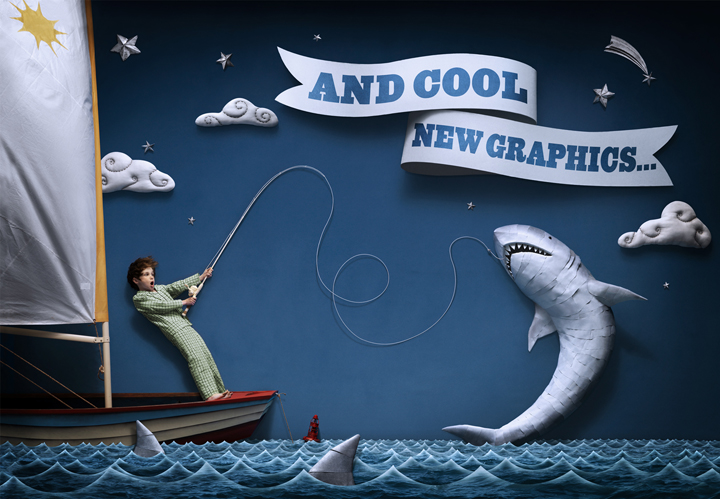
Seckler: Okay so back to the featured image, tell me how you created all the props in this shot.
Kretschmer: The clouds were the primary focus of what I was to handle and was an important part of the overall look of the images. We made them from a foamcore base that was cut to the outline shape, covered with muslin fabric and stuffed with fiberfil. The ends of the muslin were hot glued to the underside of the shape and large black embroidery thread was sewn in swirl patters. We made up to nine different shapes and sizes and strategically placed them on set to help indicate the illusion of depth.

The “ocean” was made from very large, eight foot long, panoramic photos of water texture I shot and “stitched” together in Photoshop. Each stitched photo was coupled with a photo shot with the same focal length and each eventual panel was made of a different focal length photo from each other. We mounted them to foamcore and cut the undulating pattern of water surface, paying close attention to varying the size of each ebb and flow from one cut-out panel to the other. When arranged together on set, the ensemble gave the appearance of a vast sea in a short amount of space.
Clint Zoccoli created a latex mold of the shark and circling fins that I applied photographic prints made on my Epson printer to. I used these photographic prints to add texture to the props in a unique way. It is a technique I used in the past of cutting, wetting and spray mounting each print to mold to the latex form, much like Mod Podge. He then applied the PVC teeth and button eyes. He also found a dingy through Craigslist, cut it in half, built a flat, false side to keep the boat stable on set and painted the base. He made the stars out of foam and also painted and distressed them in shades of silver. The buoy was crafted out of plumbing and lighting parts he found at a hardware store and painted red.

Seckler: Fascinating, I’ve never heard of using photographic prints to add texture to a prop. Why did you decide to go that route?
Kretschmer: The original series has a lot of that treatment. The tree I made for the original series was made out of chicken wire, armature wire, and plywood, and then I skinned it with Epson prints of tree bark. The technology is such that the ink was so stable that I could actually wet the photograph and apply glue to it. It’s almost like Mod Podge. It wrinkles a bit, but the imagery stays on there.
Seckler: How did you actually shoot this?
Kretschmer: I shot everything from above, from a birds eye view. I had to strategize how to force perspective in the shot we had a range of only 16 to 20 feet. For example I cut the waves in a way that they were smaller in the background and larger in the foreground. A space of six feet made that ocean look much deeper. To make the clouds or other props look bigger we attached it to a C-stand and then raised it up from the floor.
The camera was a Hasselblad H3D camera with a 50mm to 110mm zoom lens mounted to a Megaboom arm that was mounted to scaffolding. I shot remotely using Phocus software.
The lighting was created using a huge 20×10 foot silk with three Profoto bi-tube heads behind it. One head had a large beauty dish attached and the other two had umbrellas. I had the middle light a full stop brighter than the two flanking heads in order to obtain vignetting on the sides. Large cutters were placed between the set and silk to help the vignette effect on the upper part of the frame. A 60 inch umbrella and head were mounted to the boom holding the camera and placed directly behind it to act as the fill light.

Seckler: This image and the personal series that inspired it have a wonderful storybook quality to them. Where did your desire to shoot this way originate from?
Kretschmer: Having a child and reading illustrated children’s books, I’ve always found that an inspiration. Some of my favorite books are children’s books. It’s something I aspire towards and want to bring into some of my work. This was a big departure for me. At the time, a lot of people wanted to work with me, but they thought my work was too dark. My palette is muted, and usually it is on the darker side. The subject matter up until that point was a little bit dark and not something that people were gravitating towards if they were going to hire someone to represent their product or story. I came from an editorial background as far as where my work would appear. People liked it, but they couldn’t see where they could apply my work to their client list. So I wanted to brighten up my palette and use what inspires me.

As far as the techniques are concerned, a lot of my work may look like it’s done with Photoshop, but it’s really collage. Case in point is the image of the boxing gloves, which are human hands that have laces in them. That’s actually done with cut-out photographs. What you’re seeing is actually two-dimensional photographs that are constructed in a way to make it look like they’re three-dimensional. There’s some Photoshop done to clean up certain aspects of it, but basically it’s just in-camera.
Seckler: Why have you decided to go in this direction, using these intricate props?
Kretschmer: Because I’m not good at Photoshop. Throughout my career, I’ve worked in constructing things and cutting out photographs. I did a lot of still life. I did assemblages where I would combine objects with cut-out photographs without any people. It’s a technique I’ve been using all along.
Seckler: You mentioned that advertising people you met with said your work was a little dark and wouldn’t be relevant for some of their clients. How did that feel to take that information and say, ‘OK, should I stick with what I’m doing, or should I modify my book to suit the needs of advertising clients?’ Was that a tough decision?

Kretschmer: No, I don’t think it was. But I don’t necessarily think it was a sellout. I was able to do something that was completely creatively satisfying, but yes, it appeased a certain audience a little bit more. People react to that in a different way than they do some of my darker work. I would show my book, and some women would be repelled by it. There was an image of a boxer with his face cut out and a steak behind it. They were just like, “Ew.” But as far as compromising my creativity, I don’t think I did at all.
Seckler: Has this storybook style or approach produced a lot of work for you?
Kretschmer: I did something for Penn & Teller last summer. It’s very funny, but it’s kind of a dark, humorous approach. Then I did something for Old Spice where it’s very tongue-in-cheek, brightly-colored, and whimsical. So I’ve been able to maintain both sensibilities.
Seckler: So the original personal series you did “Blustery Day” really has changed your career hasn’t it?
Kretschmer: It’s gotten me a lot more advertising work – and good, high-profile stuff, also.
Seckler: How many ad campaigns have you done since that personal series?
Kretschmer: Six or seven? I would say four of them were really high profile.
Seckler: And the year before you did that series, how many ad campaigns did you do?

Kretschmer: Usually it takes time for people to get out there, you know? So, I shot that original series two years ago last summer. And it really didn’t take hold until Huggies, and that came across my desk a year ago.
Seckler: So the year before Huggies, you didn’t do much advertising work, right?
Kretschmer: I’ve done some advertising, but no. I was still doing mostly editorial work.
Seckler: How would you describe your sensibility as a photographer?
Kretschmer: My sensibility is a little odd. I do like odd things. I like juxtapositions. I find inspiration more from illustration and painters, true artists, rather than photographers. I worked for a gallery for a while early on, and I got a chance to be amongst painters’ work. I found what was inspiring to me was not the art itself but the techniques they used. Looking at a painting is one thing, but completely studying it and looking at technique was something else.
Seckler: In a lot of your work, the people have this plastic, mannequin-like prop quality to them. Where does that come from?

Kretschmer: Because I come from a still life background, the only difference in my work is that they’re still still lifes but they’re just people. I think that’s where that comes into play. And because I sketch things out, I like to keep to a sketch as close as possible.
Seckler: Tell me about how you got your start as a photographer.
Kretschmer: I went to Art Center College of Design and graduated in 1984. I graduated a long time ago and did the prerequisite assisting. My portfolio, I would take it to art directors, and they would say ‘this is an Art Center portfolio.’ It seemed like even though it had my own take on things, it was deemed an Art Center portfolio. I worked in still life. That’s all I wanted to do was still life. I had a few small clients, but it didn’t work out. I needed to do something different because what I was showing was not working. Coming from an artistic family with a lot of art history books and exposure to art, I wanted to do something that I really loved. I rented a studio for three months, did a bunch of images that were collage and assemblages. Then I started showing that portfolio, and couldn’t put their head around it until I got a few pro bono jobs. Then those started appearing in some of the award magazines, in Communication Arts. At that same time, I met my current rep, John Sharpe, and from there it slowly built up.

Seckler: What advice do you have for photographers who are towards the beginning of their careers?
Kretschmer: Be true to your vision. Go with your gut. Go with your heart. A big problem with a lot of photographers coming out of school is they look at other people’s work, and they think that’s what’s going to get them success. So there’s a lot of mirroring, but I don’t see a lot of individuality. It’s hard because there are so many photographers out there. As far as how to keep the ball rolling, for me, I needed to do the testing because I needed the creative outlet. I had these ideas. I needed to get them out, and I wanted to. As a result, I think putting the time, money, and effort into that certainly paid off, and I feel very blessed and lucky about that. But I’m not the guy that shoots everyday, that has that much work coming in. I feel like my work is a little more cheeky and it’s catered to a certain audience, which is limiting. So I need to keep reinventing myself, working on different things, and trying to think in different ways to make myself fresh, new and appealing.
Written by Zack Seckler
Edited by Sarah Lynn Knowles
This piece was originally published 4/1/11 on Zack Seckler’s formally named publication The F STOP.

These image floored me! Keep up the inspiring work! Really cool how all of this was put together, thanks for putting this up. Was that banner thing in the first picture with the shark actually part of the shot or is that one of those computer graphic deals?
LikeLike
Stunning and original work – thanks for sharing!
LikeLike
Very creative, really unlike anything I’ve seen in recent memory
LikeLike
Really inspiring and unique work. Art, really.
LikeLike